Transforming the Fight Against COVID-19: A Case Study of Digital Contact Tracing in Bangladesh
Sohel Adnan > Case Studies > Transforming the Fight Against COVID-19: A Case Study of Digital Contact Tracing in Bangladesh
About this Project
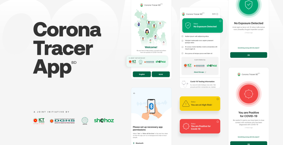
Corona Tracer BD is based on centralized system model, which describes itself as a “Privacy-Preserving Contact Tracing” system. I along with my colleagues were assigned the task to design a contact tracer app for the people of Bangladesh during this emergency.
Joint Initiative By : ICT (BD), IEDCR, DGHS, Shohoz
Date : March, 2020
Category : UI & UX Design, Digital Contact Tracing
Introduction
In mid-March, as COVID-19 cases surged globally, Bangladesh found itself grappling with a dire situation—10,000 new cases emerged daily. In response to this unprecedented crisis, the Bangladesh Government approached our company with a compelling proposition: to devise a cutting-edge contact tracing app. Within a mere three days, our UX team embarked on a whirlwind journey to design this pivotal application, setting the stage for a five-week project encompassing intensive research, meticulous design, rigorous development, and thorough testing. This comprehensive case study delves into the intricate details of our UX and product development expedition, illuminating the challenges and triumphs encountered along the way.
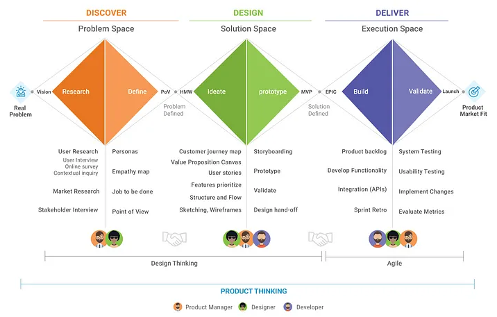
Embracing the Power of Design Sprint
Recognizing the urgency of the situation, we wholeheartedly embraced the Google Design Sprint framework, particularly the 3-Day Product Design Sprint template. However, an unexpected twist added complexity to our endeavor—the ongoing pandemic necessitated an ingenious solution: the birth of the Remote Design Sprint. This article serves as a step-by-step guide, revealing our innovative approach to designing an app remotely, all within the confines of 24 business hours.
Understanding the Monumental Challenge
COVID-19 presented a multifaceted challenge that demanded immediate attention. Its unique combination of high contagion and delayed symptom onset rendered traditional contact tracing methods woefully inadequate. Our overarching mission was crystalline: to conceive a solution capable of slowing down the virus’s spread until a vaccine became universally accessible.
Meticulously Mapping the Problem
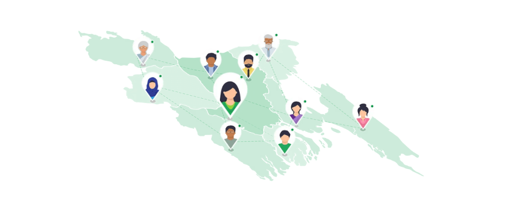
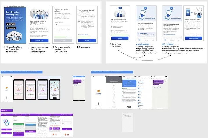
Our first step entailed a comprehensive exploration of the problem landscape. The app needed to fulfill a multifaceted role: detecting close contacts, clearly communicating users’ statuses, and serving as a repository of essential healthcare information. To gain invaluable insights, we conducted enlightening lightning talks, leveraging project vision materials, and analyzed existing contact-tracing apps like Aarogya Setu and TraceTogether. These analyses unearthed critical features and functionalities to address our unique market’s needs.
Navigating Technology Considerations and Opportunities
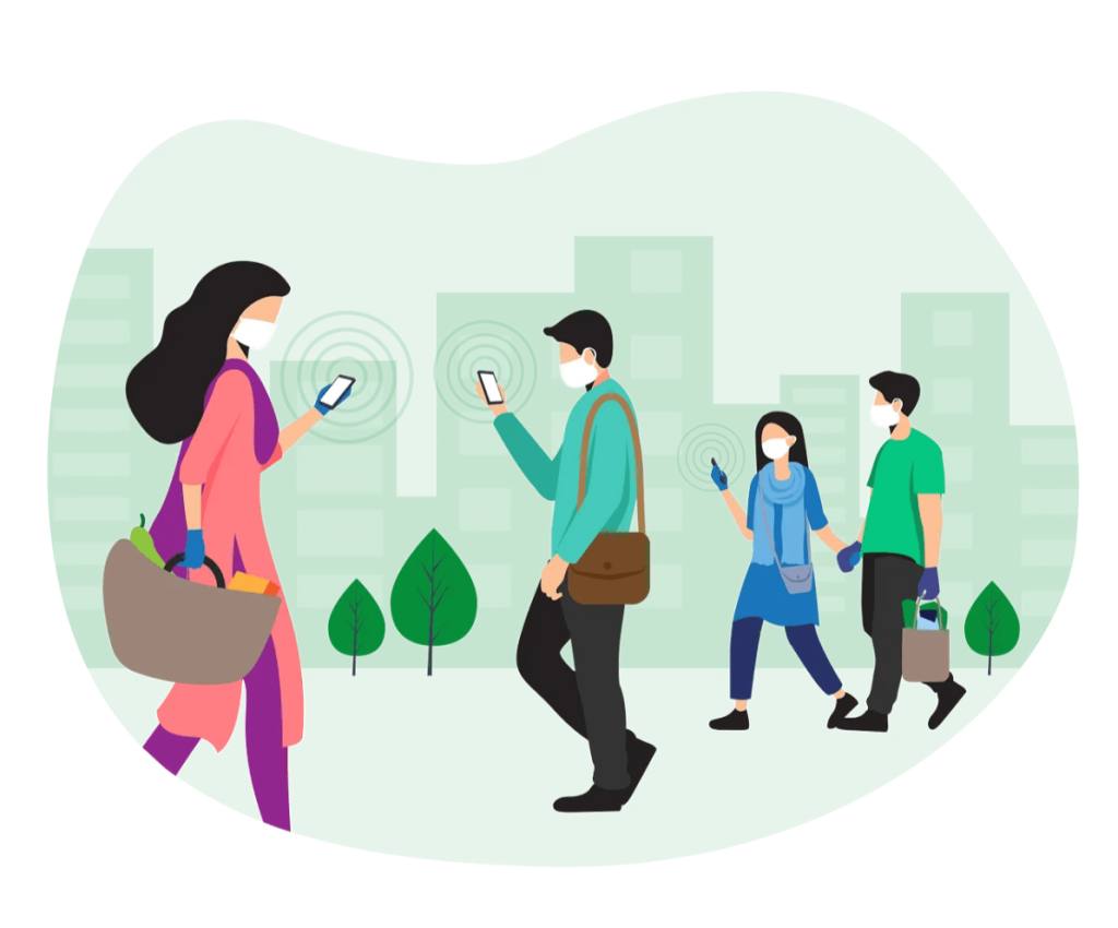
Privacy stood as the paramount concern in our mobile-based solution, which harnessed the potential of Bluetooth Low Energy (BLE) technology. We strategically aimed to launch the app on the Android platform to cater to the mass market in Bangladesh, necessitating seamless collaboration with five government departments. The app’s robust micro-service architecture found its home on the Azure Cloud Platform. In our quest to grasp the intricacies of Bluetooth-assisted contact tracing, we avidly explored relevant technical articles and resources.
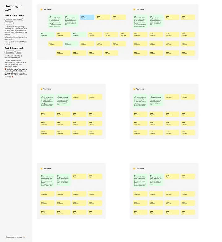
Defining the “How Might We” Questions
Harnessing the power of digital collaboration tools such as Miro and Figma, we engaged in a thought-provoking How Might We session. This pivotal exercise unearthed crucial questions to guide our design process, including:
– How might we effectively communicate a user’s COVID-19 status? – How might we notify users of possible infection without triggering social unrest?
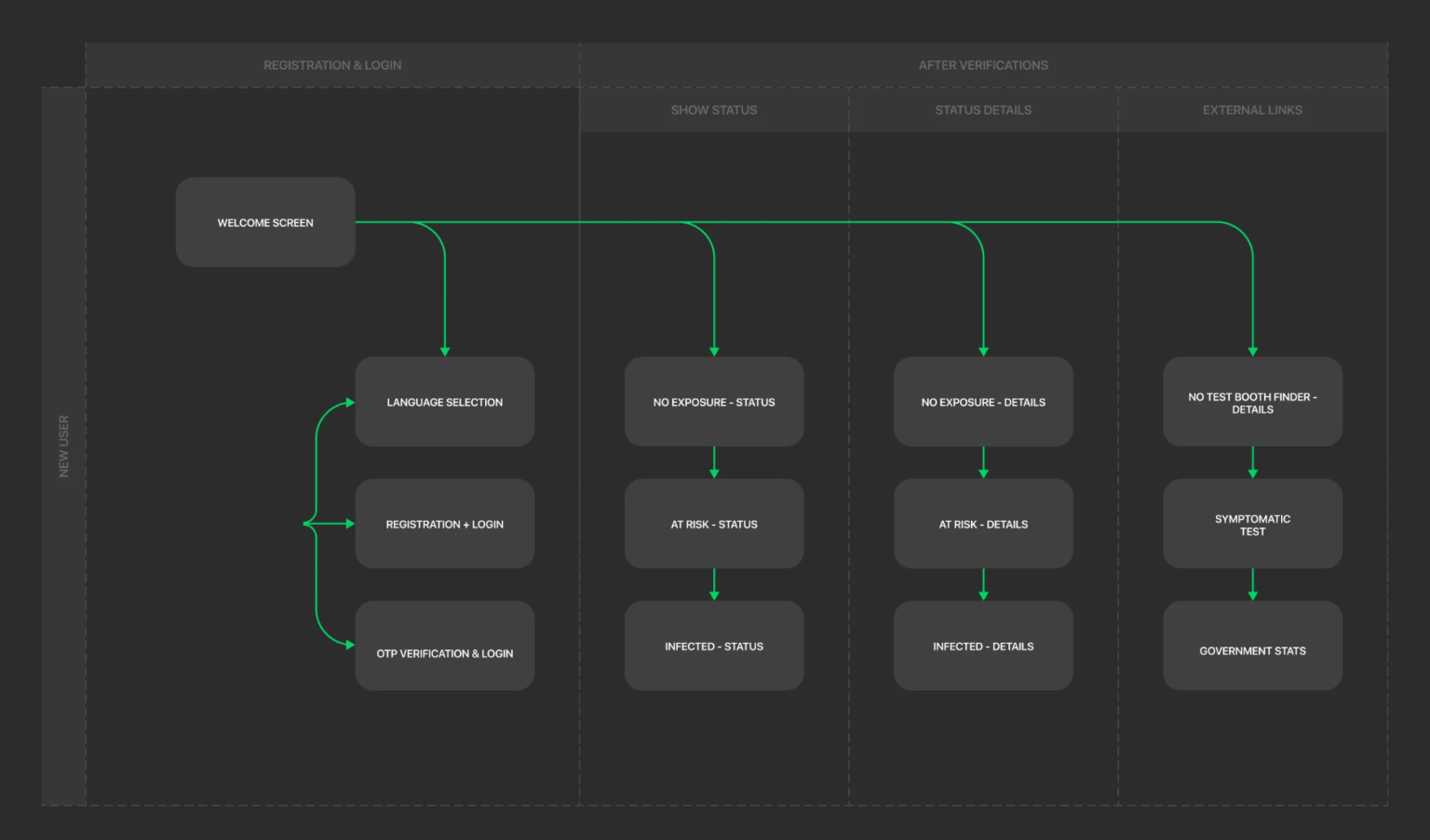
Illuminating the User Journey Flow
Our journey began with a meticulous mapping of the user’s experience, step by step. This granular exploration allowed us to identify pain points and challenges that demanded innovative solutions.
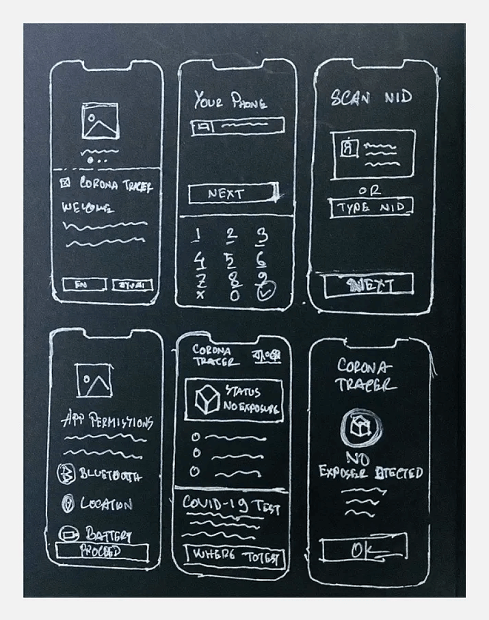
Sketch and Prototype Design
With the foundational understanding of our app’s goals firmly in place, we transitioned to the next phase—sketching and prototyping. This dynamic process of rapid iterations fostered a “no judgment” atmosphere, encouraging the emergence of audacious ideas while also serving as the crucible where suboptimal solutions were deftly cast aside. Below is a glimpse of the final sketch:
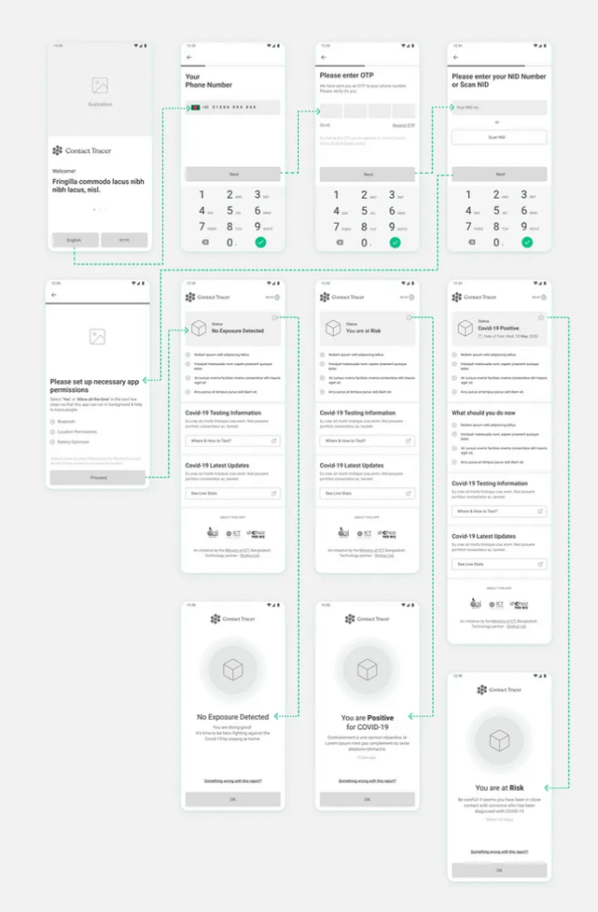
Evolving Wireframes
Wireframes, often likened to the skeletal framework of our app, took center stage next. These wireframes served as the blueprint upon which we would layer the visual design. Embracing high-fidelity wireframes streamlined the subsequent visual design process, expediting our journey.
Drawing Inspiration from Visual References
Once the wireframes were in place, we embarked on an expedition to uncover visual references within the market. This treasure hunt helped us craft a moodboard that would serve as the North Star guiding our app’s aesthetic.
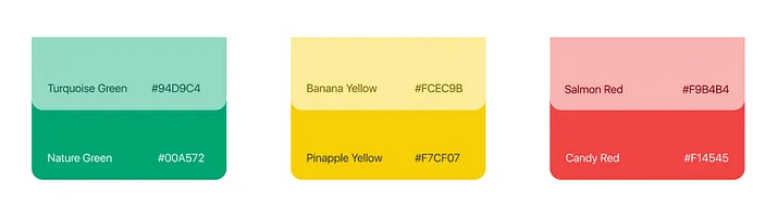
Crafting a Distinct Color Scheme
Our color scheme, a vibrant tri-color palette, was meticulously selected to ensure clarity and user-friendliness. Green symbolized “No Exposure,” yellow represented “Potentially Exposed,” and red signified “COVID Positive.”
Streamlined Iconography
To expedite development within our tight timeline, we opted for flat, less intricate icons that users could effortlessly recognize. A series of video calls gauged user reactions and the time taken to identify these icons, resulting in our finalized iconography set.
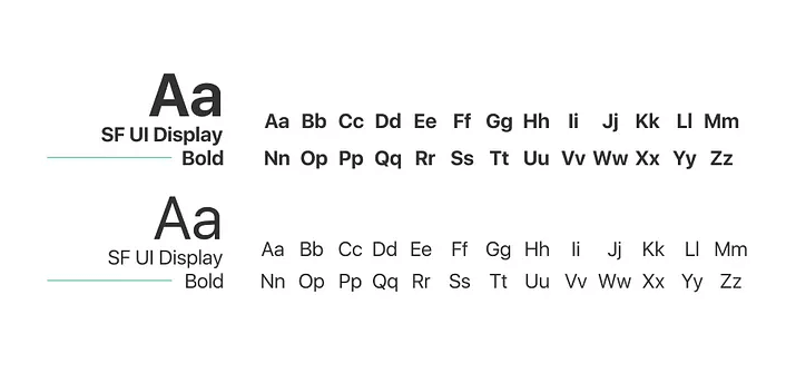
Typography That Speaks Volumes
Our typography choices were carefully curated to enhance readability and user engagement.
Charting the Next Steps and Drawing Key Conclusions
Following the design phase, the app entered a crucial phase of validation and improvement based on real-world usability testing. In the future, these findings will drive iterative design enhancements and further improve the user experience.
In Conclusion
Projects, especially those borne of necessity during a global crisis, inevitably encounter deadlines and restrictions. Our journey was no exception. While we adhered to best practices, there were conscious decisions made along the way to accommodate the exigencies of our situation.
Learning from the Experience
From a project perspective, the app’s download numbers exceeded all Key Performance Indicator (KPI) expectations. However, from a product standpoint, our journey presented a mixed basket of insights. Several critical learnings emerged:
– Clarity regarding the app’s scope was pivotal, as many users anticipated features beyond its intended purpose. – Managing user expectations proved to be a complex challenge, with some users viewing the app as a panacea for the pandemic, while others recognized its limitations.
Acknowledging Shohoz
We owe this unique project’s success to Shohoz, the largest consumer tech platform in Bangladesh. A heartfelt expression of gratitude goes out to the Shohoz leadership team, with special recognition for Maliha Quadir, Founding Managing Director, who has been acknowledged as one of the top female founders globally for her instrumental role in raising substantial support for Bangladesh’s fastest-growing startup.
In Retrospect
In the crucible of a global pandemic, we forged an innovative and indispensable tool. Despite the challenges, we met our objectives and contributed significantly to the battle against COVID-19. This case study stands as a testament to the power of agility, innovation, and human determination in times of crisis.
Looking to the Future
As we reflect on our journey, we recognize that there is no ideal project without constraints. However, these constraints can be the catalysts for innovation and progress. Our relentless pursuit of excellence continues as we strive to make a meaningful impact on the world’s most pressing challenges.
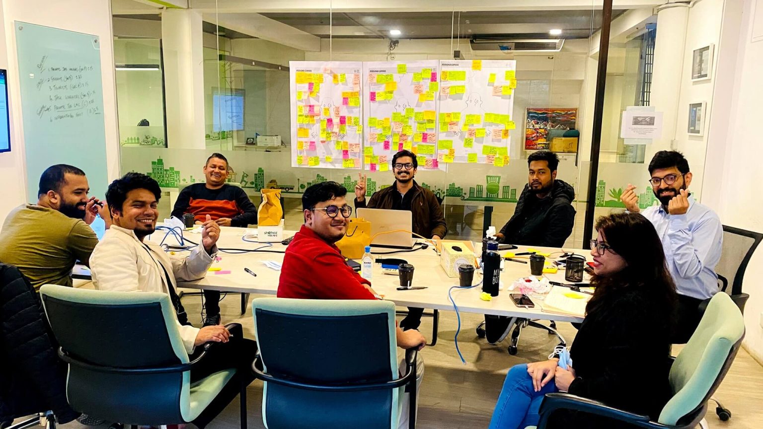
Team Collaboration on the Project
Design on Figma
Kindly access and review this project on the Figma platform