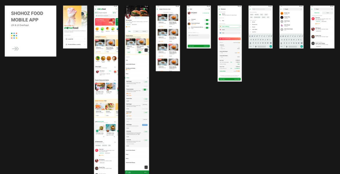
About this Project
This case study will focus on a food delivery app called “Shohoz Food,” which aims to provide a convenient and reliable service for users to order food from their favorite restaurants.
Company : Shohoz (BD)
Date : March 21, 2020
Category : UI & UX Design, Technology
Introduction
Food delivery apps have become increasingly popular in recent years, as they offer a convenient way for customers to order food from their favorite restaurants without having to leave the comfort of their own homes. However, designing a user experience (UX) for a food delivery app can be challenging, as there are many factors to consider, such as ease of use, speed, accuracy, and security. With such a competitive market, it is important for these apps to provide a seamless and enjoyable user experience in order to stand out and attract customers.
Background
Shohoz Food was launched in 2018, and initially struggled to gain traction in the crowded food delivery market. The app faced several challenges, including a cluttered and confusing interface, slow loading times, and a limited selection of restaurants. As a result, user retention was low and the app struggled to attract new customers.
In order to improve the user experience and increase customer satisfaction, Shohoz Food underwent a major redesign in 2020. The app focused on streamlining the ordering process, expanding its restaurant selection, and improving the overall user experience.
Process
The redesign process began with user research and analysis, in order to better understand the needs and pain points of Shohoz Food users. This included conducting user interviews, surveys, and usability testing.
User Research
Before designing the UX of the Shohoz Food app, the team conducted user research to understand the needs and preferences of their target audience. We surveyed a group of customers who frequently used food delivery apps and asked about their experience with the app, including the ease of use, speed, and overall satisfaction.
The team also conducted usability testing with a small group of users to observe how they interacted with the app and identify any areas of frustration or difficulty.
Design Process
Based on the research findings, Shohoz Food identified several areas for improvement. These included:
-Navigation: The previous version of the app had a cluttered interface, with too many options and menus. This made it difficult for users to find what they were looking for and resulted in high bounce rates.
-Restaurant selection: The app had a limited selection of restaurants, which made it difficult for users to find the food they wanted.
-Ordering process: The ordering process was slow and confusing, with multiple menus to navigate.
-Loading times: The app had slow loading times, which made it frustrating for users to wait for pages to load.
-Ease of use: Many users reported that the app was difficult to navigate, with too many steps required to place an order. To improve ease of use, we redesigned the app to have a more intuitive and streamlined flow, with fewer clicks required to complete an order.
-Speed: Some users reported that it took too long for their orders to be delivered, which frustrated them. To improve speed, the team implemented a real-time tracking feature that allowed customers to see the location of their delivery driver in real-time, as well as an estimated arrival time.
-Accuracy: Some users experienced issues with their orders being incorrect or incomplete, which was frustrating for them. To improve accuracy, we implemented a confirmation step before placing an order, allowing users to review and confirm their order before it was submitted.
-Security: Many users were concerned about the security of their personal and financial information when using the app. To improve security, the team implemented additional measures, such as encrypting all data transmitted through the app and requiring users to create secure passwords.
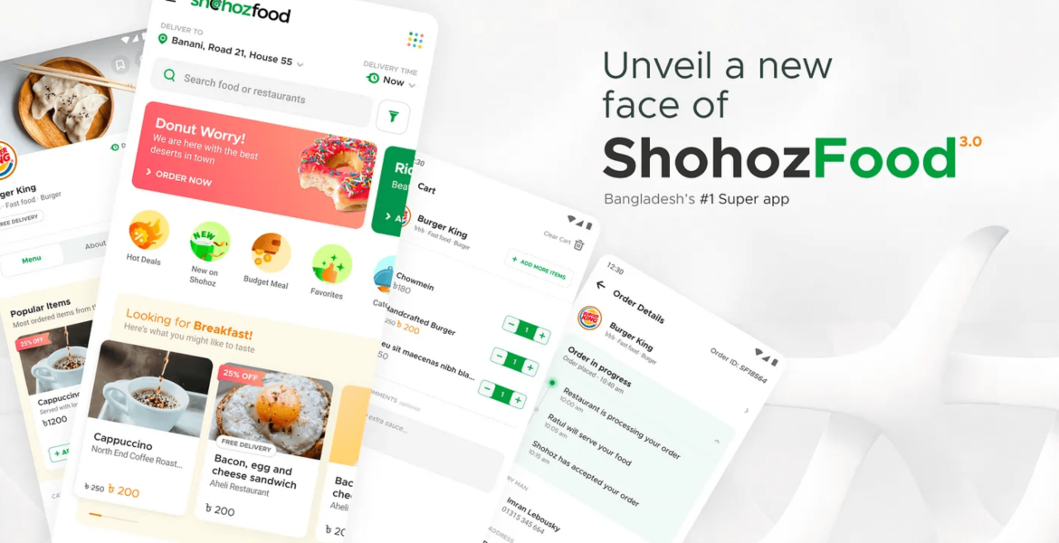
To address these issues, Shohoz Food focused on redesigning the app to be more intuitive and user-friendly. This included simplifying the interface and reducing the number of menus and options, improving the restaurant selection and adding filters to make it easier for users to find what they wanted, and streamlining the ordering process by reducing the number of steps and menus.
Additionally, we worked on improving the app’s loading times and overall performance, by optimizing images and code and using more efficient servers.
Results
After implementing these design improvements, the team conducted a second round of usability testing to measure the effectiveness of the changes. The results were overwhelmingly positive, with users reporting that the app was much easier to use, faster, and more accurate than before.
From that we could say the redesign of Shohoz Food was a success, resulting in a significant improvement in user satisfaction and retention.
One of the key areas of improvement was the navigation and interface, which was simplified and made more intuitive. This made it easier for users to find what they were looking for and reduced bounce rates.
The expansion of the restaurant selection and the addition of filters also had a positive impact, as users were able to more easily find the food they wanted. The streamlined ordering process also made it easier and faster for users to place their orders.
Finally, the improvements to the app’s performance and loading times also had a positive impact, as users no longer had to wait long periods of time for pages to load.
Conclusion
The redesign of Shohoz Food was a success, resulting in a significant improvement in user satisfaction and retention. By focusing on streamlining the interface, expanding the restaurant selection, and improving the ordering process, Shohoz Food was able to provide a more seamless and enjoyable experience for its users. Additionally, the improvements to the app’s performance and loading times helped to reduce frustration and improve overall user satisfaction.
Overall, this case study demonstrates the importance of understanding user needs and preferences in UX design, as well as the value of testing and iteration in improving the user experience.
Design on Figma
Kindly access and review this project on the Figma platform